
November 2022 - February 2023, (12 weeks)
Timeline
My Role
Independent project as a UX Designer

T H E P R O C E S S
P R O B L E M
Health conscious consumers find it difficult to search for restaurants that cater to their specific dietary needs.
As a food enthusiast with a gluten intolerance, I would spend hours trying to find restaurants that catered to my specific dietary needs. This made eating out feel like a chore. I wondered, I can’t be the only one who feels this way, and it really shouldn’t be this hard.
S O L U T I O N
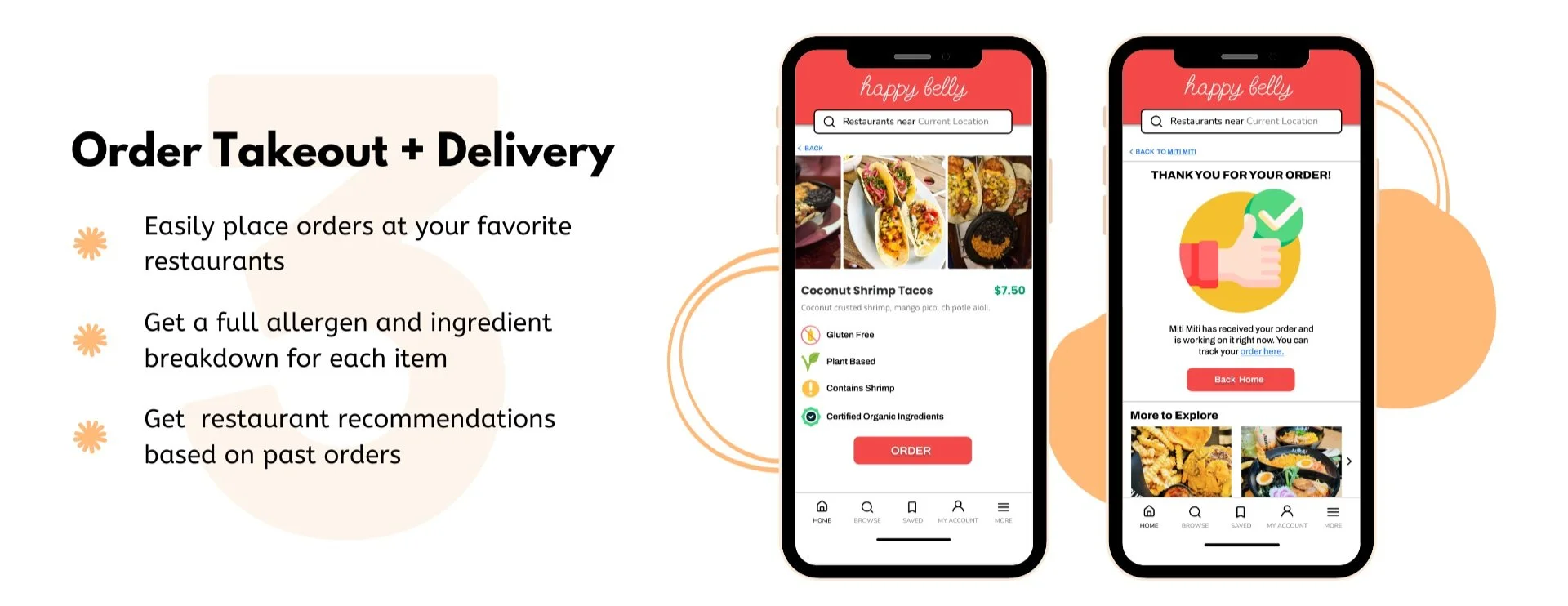
Wouldn’t it be great if there was an app that took the legwork out of finding restaurants?


C O M P E T I T V E A N A L Y S I S
The competition left room for much to be desired.
Whereas many food search and delivery apps provide basic filtering by price, location, and general dietary needs (vegan or vegetarian), none of the existing apps cater to the health conscious consumer in mind, and by doing so leave a gap for those with complex dietary needs and preferences.

U S E R I N T E R V I E W S
RESEARCH QUESTIONS:
Tell me about the last time you went out to eat or ordered food from a restaurant?
Did you use a mobile app or the internet to research the restaurant before going out to eat or ordering from there?
How was your experience trying to find a restaurant you wanted to eat or order from? What did the process look like?
How long did it take you to find a restaurant to eat or order from?
How do you think this experience could be improved?
I conducted remote user interviews to gain an understanding of my users’ needs, goals, and challenges. I recruited 5 participants who either had specific dietary preferences or restrictions, and asked them questions focused on their experiences with utilizing food based apps to either find restaurants to eat out at or order from. I then analyzed my users' answers by sorting them into an affinity map to gain overarching insights.
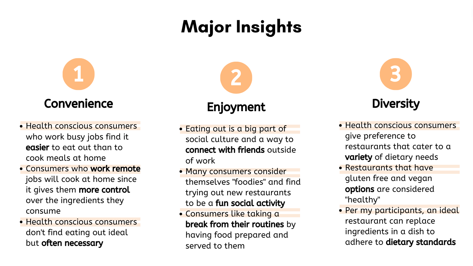
My user research confirmed that health conscious consumers find it challenging to search for restaurants that cater to their specific dietary needs.
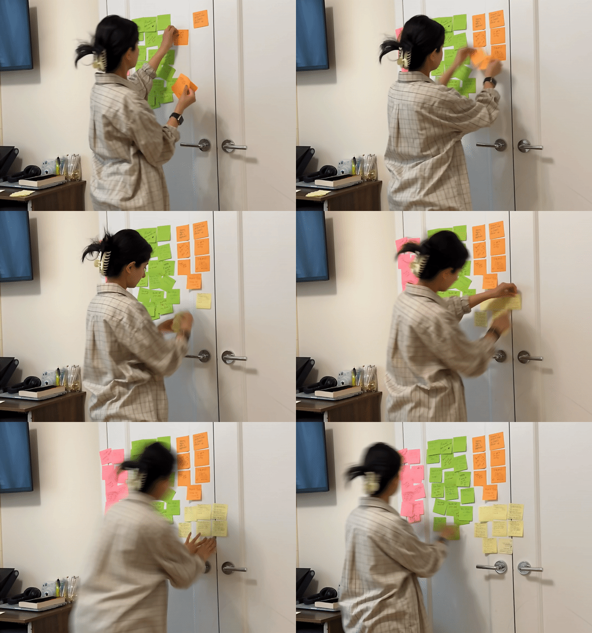
The users I interviewed found the process of finding diet conscious restaurants frustrating.
P R I M A R Y I N S I G H T
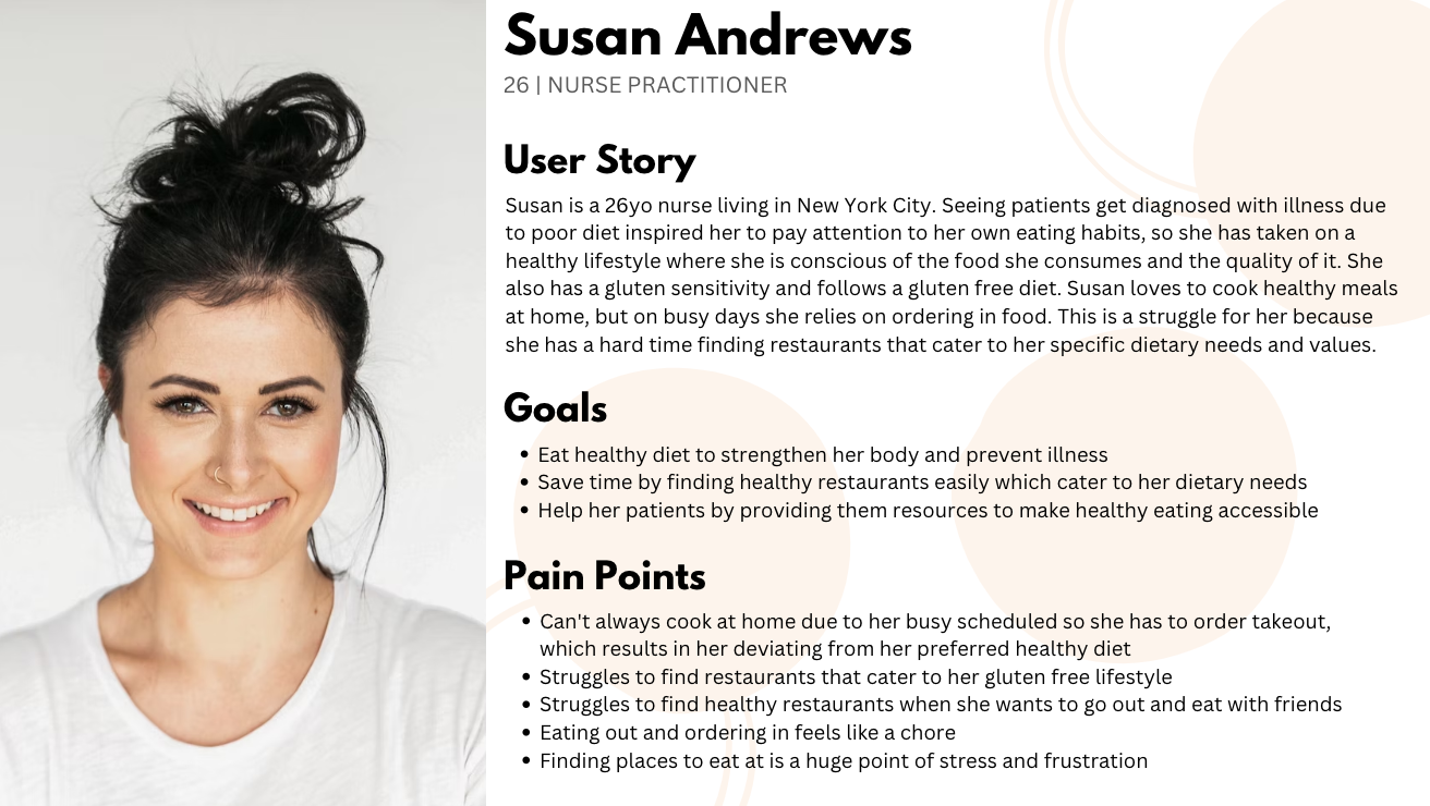
H E A L T H C O N S C I O U S U S E R P E R S O N A
Site mapping and low-fidelity wireframes helped determine what user requirements the app should fulfill.
D E S I G N
I created a site map to organize the structure of my app and the user requirements it should fulfill. This allowed me to have a visual representation of the screens to determine how they should relate to each other. I also sketched some low-fidelity wireframes with pen and paper to get an idea of what I want the app to look like and how I want the users to interact with it.


T E S T I N G + I M P R O V E M E N T S
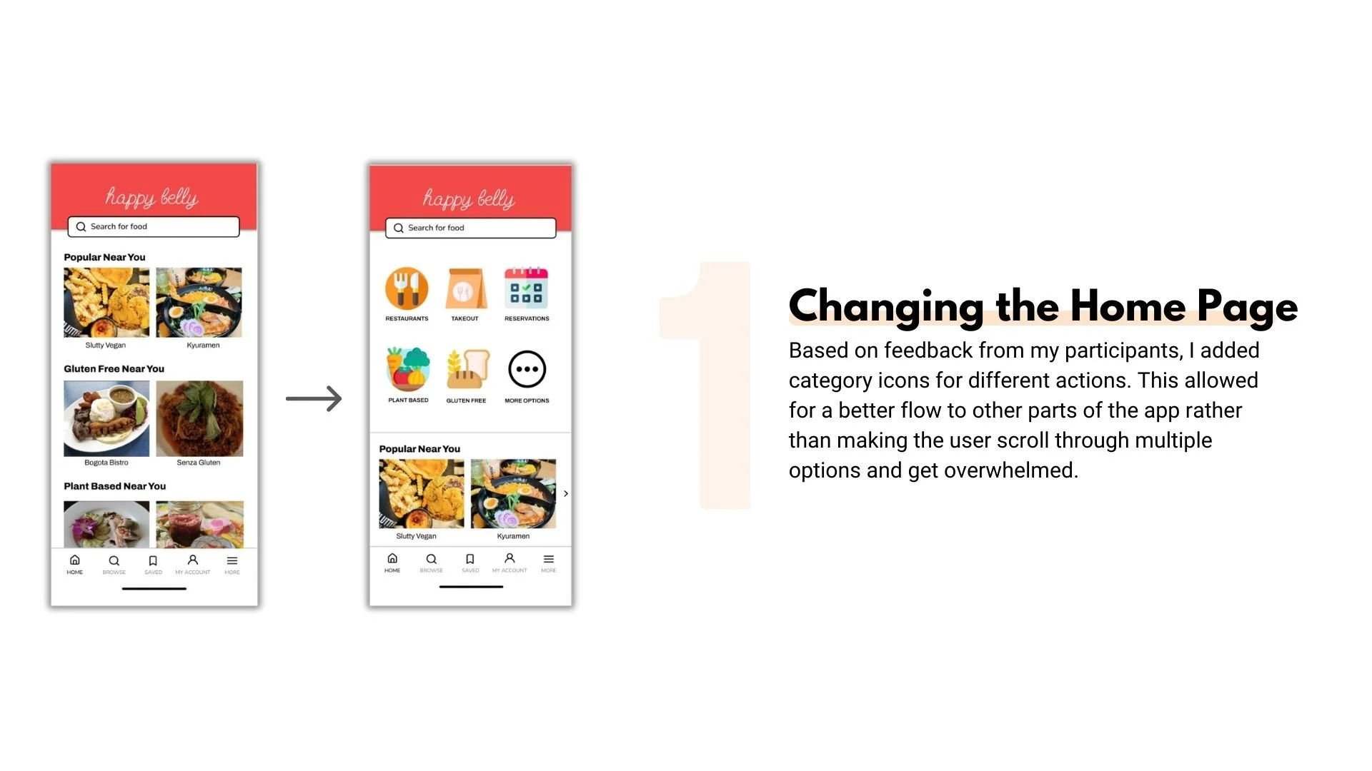
Three improvements to my design:
Based on the feedback I received from my participants, peers as well as my mentor, I iterated my design continuously to make it more user friendly. The three major improvements I made were:


The final product:
F I N A L S C R E E N S
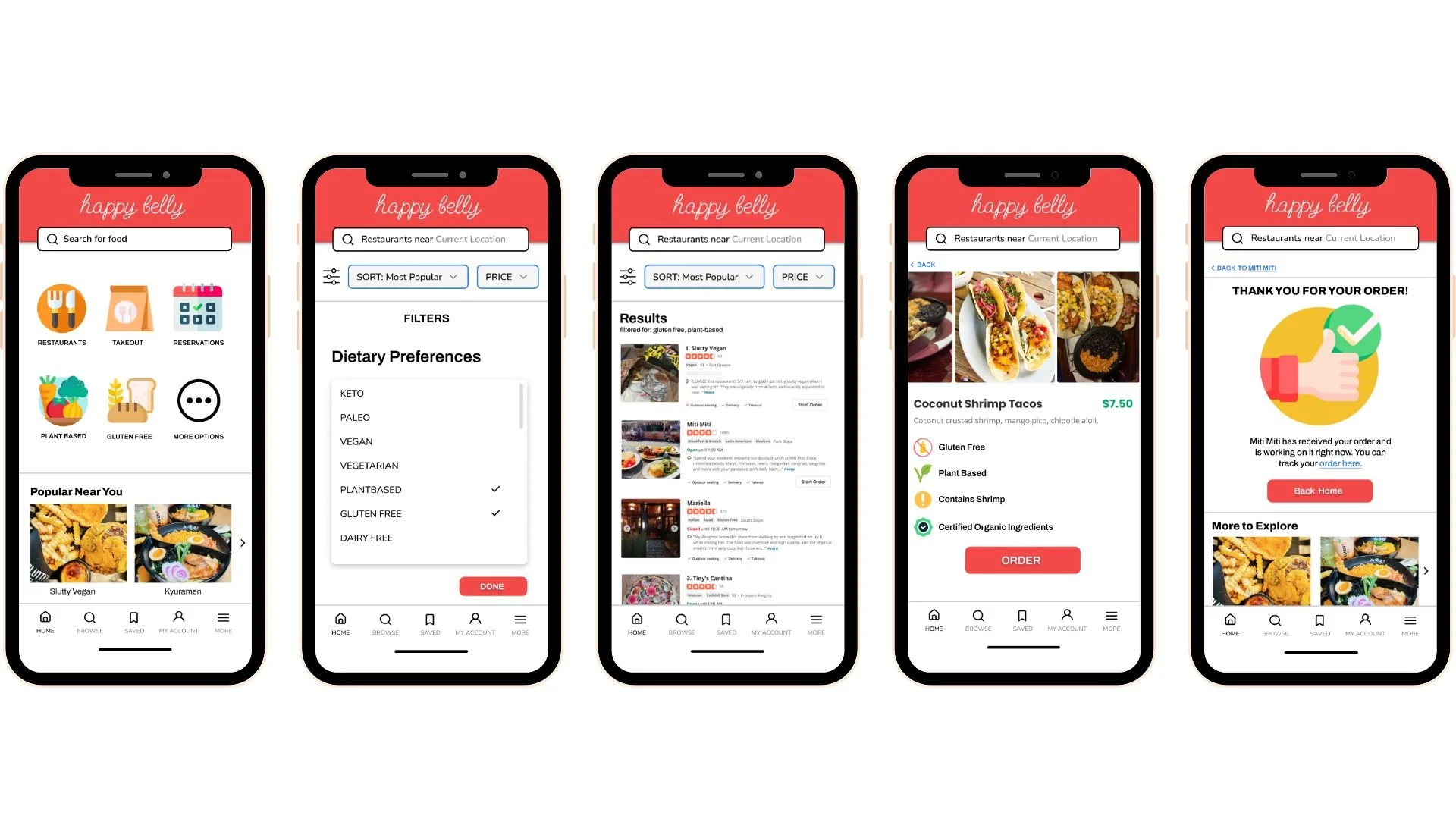
Created with Figma
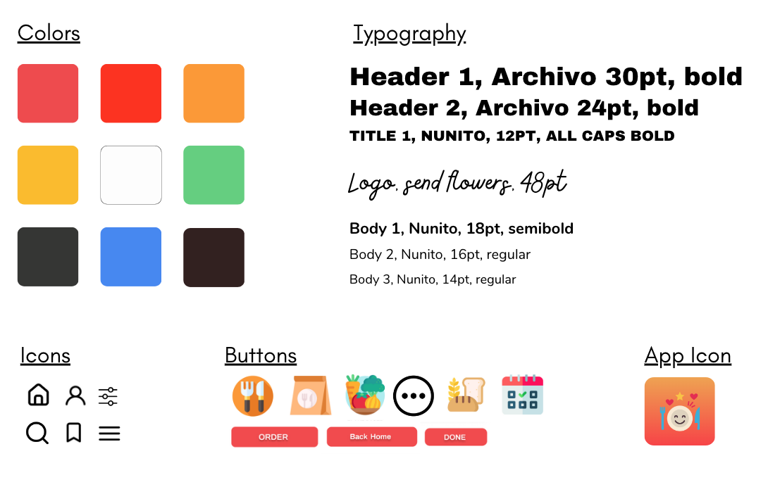
The Style Guide:
C O N C L U S I O N S + F I N A L R E F L E C T I O N S
What I will do differently next time.
This was my first UX project and I learned so much during the entirety of it. Going through an entire UX process really helped put into perspective what elements of design to look out for and how to think from a user’s point of view. Some key learnings for me were:
Keep the user front and center. Many times when I was doing usability testing and collecting feedback, I had to remind myself to put my personal preferences aside and really let the user guide me from their experience interacting with the app. For example, the first iteration of the home page screen (which I thought was pretty good) was something majority of the users wanted changed. In this scenario, I had to step back and objectively incorporate that feedback into my overall design to make it more user friendly.
Testing is an extremely important part of the process. Initially I thought that creating site maps and wireframes would be the most important step in the process, but I quickly learned that it was in fact usability testing. Testing was crucial in helping find errors and seeing things from a different perspective. For example, when I added the “order now” button to the restaurant page without adding the option for the user to see the full menu. Many users expressed frustration at this since it disrupted their flow, so I incorporated that insight into my new design.
Iterate and refine as much as you can. I created low fidelity wireframe sketches several times to get a better understanding of how I wanted my app to flow, and once I translated them into Figma, I iterated the design over 10x to make sure each component served a purpose and added to the user experience.
Be open to constructive criticism. Having my peers and mentors review the app and provide me their honest opinions was a crucial step in helping improve the design and flow of the app. For example, my mentor suggested adding a filter icon to my design rather than a next button to allow for a better flow. This helped improve my design, and when I presented the two different screens to users (in an A/B testing set up), they all preferred the one with the filter icon over the one with the next button.
Thanks for reading :)
For more inquiries or to work together, email me at znb.rehman68@gmail.com